AZEITE
Branding
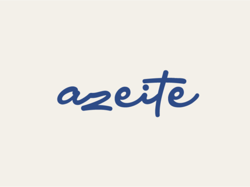
The design challenge for the Azeite branding project involved creating a comprehensive brand identity for an olive oil company that pays homage to Portuguese heritage and craftsmanship. Named Azeite, which translates to “olive oil” in Portuguese, the brand aimed to capture the essence of Portugal’s rich olive oil culture while conveying a sense of quality, tradition, and authenticity. The task encompassed developing a visual identity, including a logo, color palette, and typography, as well as packaging design mockups that reflected the brand’s values and resonated with consumers.
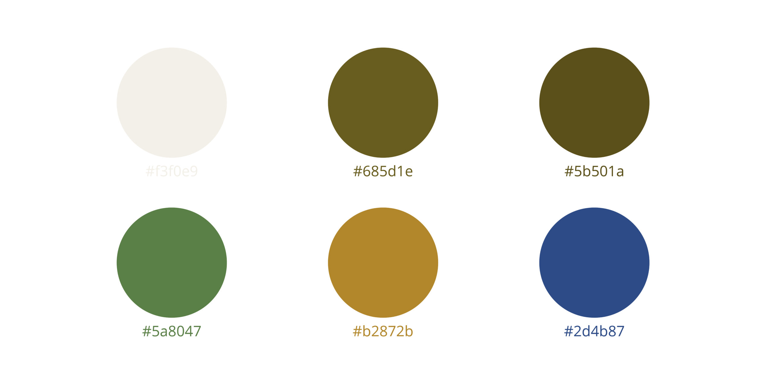
The culmination of the branding process yielded a distinctive visual identity that distinguished Azeite as a premium olive oil brand with Portuguese roots. The logo, featuring elegant typography and the asset of the iconic olive branch motif, evoked a sense of tradition, craftsmanship, and quality. A carefully curated color palette, inspired by natural hues imbued the brand with warmth and sophistication.
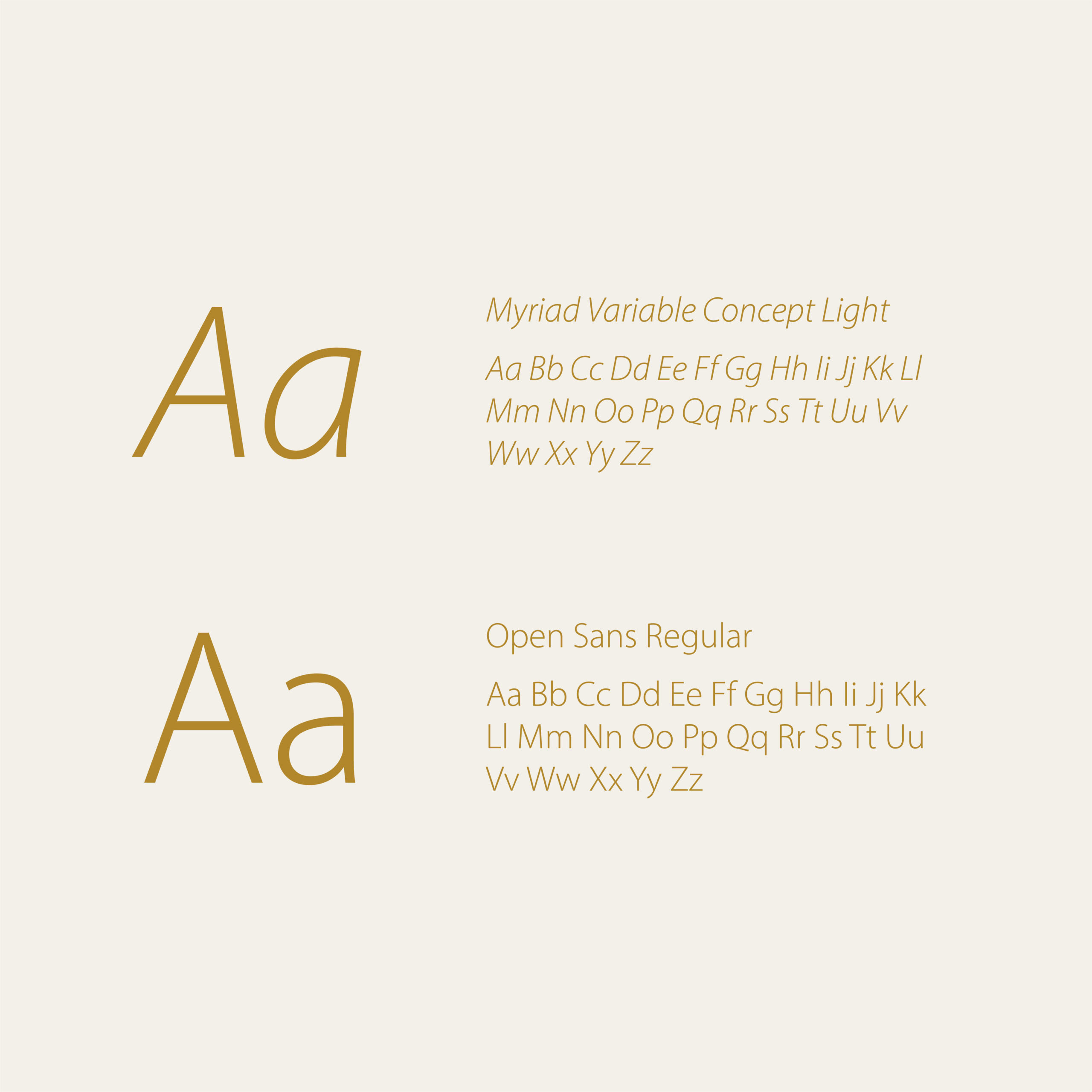
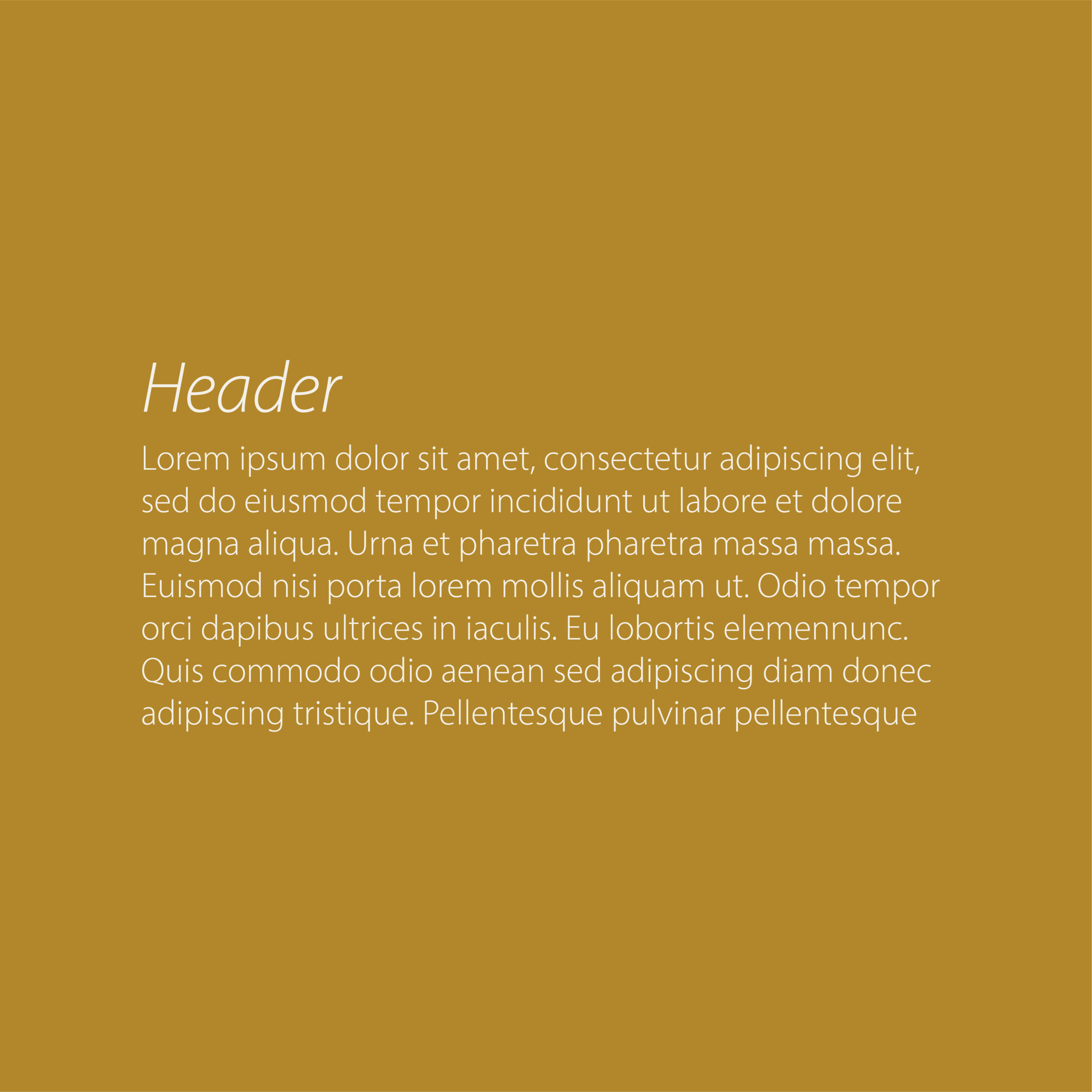
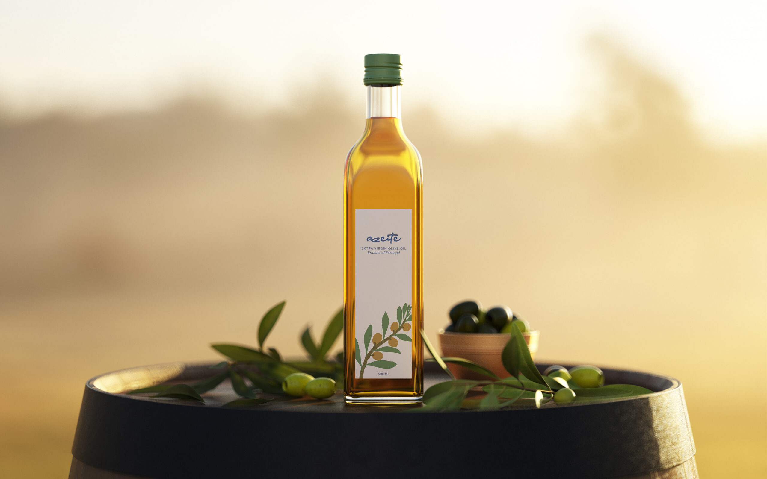
Complementing the visual identity, selected fonts and brand collateral, including packaging designs, further reinforced Azeite’s commitment to quality and authenticity. Mockups of packaging designs showcased the brand’s products in elegant, minimalist containers that emphasized the purity and freshness of the olive oil.

View More Work

